Monday 14 November 2011

Full Storyboard and Shot Types


To ensure that we, and each of the cast members within our music video know what they are doing throughout the recording proccess we created a storyboard containing what/who will be featured in each shot along with camera angles, movements and shot types. This is very important as it will allow the recording process to be done as quickly and efficiently as possible, by avoiding any confusion between cast members and where/how the camera should be placed. It will also mean that we will be organised, knowing what props/actors need to be in each place at a particular time. The full storyboard can be seen below. 


For the purpose of the plan, we felt it would be easier to contain each shot that will be featured at the end and beginning of the video as this is where the narrative is. The middle (party scene) will be a variety of short, fast-paced clips similar to that of a montage, therefore we decided to only include a few of the shots that we would definitely like to include in the montage. Other clips will be used, however they will be based on the behaviour of the cast members at particular moments when we position the cameras in the correct position during filming.

Thursday 10 November 2011

Music Video Location Recce

Before filming our music video, we must ensure we have considered every aspect of health and safety by answering the recce questions.
Are there any potential hazards that could pose a potential health and safety risk where your music video will be taking place?
Due to the locations we will be filming in - woodland areas and abandoned places, there are several hazards that could present serious risks. For example, when filming in woods there will be objects such as rocks and branches which could present a trip hazard. Also, in the abandoned place there may be tripping hazards and dangerous items such as sharp objects.

What will you do to ensure these risks are minimised?
To ensure the risks are minimised in the woodland area we will choose a small area, that we will tidy should there be any rocks or broken branches lying around. For the abandoned places that we will film in we will clean the area first to get rid of any potential hazards using the appropriate methods.

Will the time of day/weather affect the outcome of the music video?
Due to part of our music video being filmed outdoors we need to make sure that it is not windy or raining - similar to the conditions of our photoshoot so that we do not damage the equipment and so we get the best conditions possible to allow us to shoot our video. However, we would like to film part of our video at a late part in the day which may not give us enough time to capture all of it in one day meaning we may have to spread the filming over several days.

Have you considered lighting? What about the problems of natural lighting? Will you need to use a flash?
Due to the time of day we will be filming we may need extra lighting for the location and the camera to make sure that everything will be visible enough in the scenes.

Do you need permission to record your music video in the location you have chosen?
As we are filming parts in woodland areas we will not need any permission. However, as we want to film parts in an abandoned area we will need to ensure that the area is in fact abandoned and is not anyones private property.

Are other people likely to be an issue for you?
For certain parts of our video we will be filming in public places so other people could walk past and cause an  issue for us. However, if this is the case we will simply choose another location or ask the people politely to move until we have finished filming.

Are you reliant on lifts/props/friends' equipment/models? How have you planned that these things will come together at the appointed time?
Our music video will be featuring a large number of people, to make sure that it looks proffesional. This means that we will have to get in contact with as many people as possible in order to arrange a suitable time that everyone is available to make. Our equipment will be property of the college so we will need permission from our lecturer before we can begin to record.

Wednesday 19 October 2011

Location Ideas - Music Videos.

As the theme of our music video revolves around a party, the other members of my group and I decided to choose an urban location to film as it will add to the videos atmosphere. Below are some images similar to the location that we will choose.

We chose an abandoned, run down area to add to the atmosphere, as in our research we found that these areas are popular in TV shows such as Skins which is popular with out target audience. It may also allow them to find our music video more interesting and easier to relate to.

Tuesday 18 October 2011

Time Management (5 Weeks Until Deadline)

As part of our A2 media studies coursework we were required to complete several posts relating to research, planning and inspiration to create the initial ideas for our music video, CD Digipak and Magazine advertisement. After we had looked carefully at the inspirational texts we had chosen we then created the flat plans for our products and the subsequent first drafts. In order to improve our products as much as possible we sought feedback from our peers and lecturers regarding our print tasks and made changes through several drafts. At this point in the course, we have successfully completed all aspects of our printed tasks. Therefore we have now begun the proccess of producing our music video.

With 5 weeks to go until the deadline we have completed the following tasks:

  • The initial plot idea for our music video.
  • The conventions we will try to include from our chosen genre of music.
  • Costume/Make-up/Character ideas.
  • Chosen Soundtrack.
  • Rough draft of our storyboard and shot types.
The above tasks have provided us with sufficient planning to create our full storyboard and shot types to create our music video - which will be produced in the next five weeks. However, to ensure this is completed we must complete the following tasks:
  • Decide on the final location/s for our music video.
  • Complete the appropriate recce to ensure that all health and saftey issues are properly assessed to make sure everyone is safe.
  • Choose and collect the props that we would include in our video.
  • The shooting and filming of the music video.
  • The editing of the music video and adding of the soundtrack.

Monday 17 October 2011

Peer Feedback - Digipak & Magazine Advertisement (Final Drafts)

To make sure that we have created products that look both professional and appealing to our target audience we thought that it would be a good idea to seek feedback from our peers. As they themselves are members of our target audience. To get the feedback we desired we printed out our tasks and glued them onto large pieces of paper so that our peers would be able to write any comments and opinions they thought appropriate. We filmed their participation in the feedback which can be seen below.

However, the feedback given cannot be read on the video so to display the feedback in a way that can be easily read we took images of the pieces of paper. Which can be seem below.


Sunday 16 October 2011

Magazine Advertisement Fourth Draft

This is the fourth and final draft for our magazine advertisement. Although we were pleased with the third draft and orginally intended for that to be the final draft we felt it would be benefical if we reconsidered the design of the advertisement like we had done with the inside sleeve and front cover. Also, the departure of one of our group members meant that we had to res-shoot the photos and therefore change the image on the advertisement. After we had made the changes to maintain consistency we found that we were again very pleased with the draft and would use it as the finished product.

Saturday 15 October 2011

Inside Sleeve Second Draft

This is the finished second draft of our inside sleeve. Similar to the first drafts of our other products we were very pleased with the first outcomes, however, after recieving feedback from our lecturer and other factors we decided that changes needed to be made to the product. When we first completed the photoshoot for our first draft of the CD cover we did not consider taking the images for the inside sleeve at the same time, which turned out to be beneficial as we were able to use the same backdrop for these photos during the amended photoshoot. Once the images were taken we were then able to edit them to create more consistency with the front cover, particularly by giving them a vintage/dishevelled effect. We were then able to insert the images into the polaroids to complete the layout. However, we did have to make one significant change to the layout as one of our group members left which meant that we would only have three pictures rather than four, so we moved the other items around until we found a layout that we were happy with.

Friday 14 October 2011

CD Cover Second Draft

Despite being very pleased with the first draft of our CD Cover after recieving feedback from our lecturer and peers we decided to make some changes based on the feedback that we were given. Our lecturer felt that the orginal image was not consistent with the theme of our product after we completed the other elements of our CD Digipak. She also felt that the image was not controversial enough so we decided to completely change it rather than simply change some elements. In order to remain some consistency with the rest of the digipak we used the background that features on both the back cover and inside sleeve.

Thursday 13 October 2011

Amended Photoshoot Front Cover and Inside Sleeve.

When we received feedback from our lecturer and several of our peers we found that many did not that that our images were controversial enough when they considered it with the theme of our music video/products and the genre of music that we had chosen. Our lecturer advised us to use more props such as cigarettes and alcohol to try and enhance the image. We decided to re-shoot the images and keep the same outdoor backdrop, but to change our body language and the usage of props to create a more controversial and consistent front cover. By this point we had also produced the flat plan for our inside sleeve we needed to take the images to feature on this.

Amended Front Cover Images


Inside Sleeve Tester Photographs


Inside Sleeve Photographs


 Final Chosen and Edited Images


Wednesday 12 October 2011

Magazine Advertisement Third Draft

After recieving feedback from our lecturer about our second draft we made the suggested changes in order to improve our magazine advertisement further. To make it look more professional we added an album review snippet from Kerrang Magazine onto the playing card at the top- a feature found on professional advertisements. We chose Kerrang as it is a magzine concerned with the genre of music that we are using as a backing track for out music video but it is also a popular magzine with our target auidence so they can relate to it more, encouraging them to buy it. We were also told to add more conventions onto advertisements so we chose to add endorsement logos from Blackberry and Pepsi - again these are popular with our target audience. The final change we made was placing the album cover onto the item screen giving the magazine a more realistic and professional look.

Tuesday 11 October 2011

CD Back Cover First Draft

This is the first draft of our CD Back Cover. It is similar to the ideas that we first had in mind, so overall we are extremely pleased with the way that it has turned out. There were slight issues with the readability of the track names as they were placed on cigarettes - however, we decided to choose a simple font and colour so the idea still worked. In order to make it look proffesional we included information about the record label and copyright laws as this is a common feature found on many existing CD Back Covers as welll as the conventional barcode. Finally, we included a URL at the top of the cover as the internet is a popular medium with our target audience, particularly when it comes to website advertising.

Monday 10 October 2011

CD Cover Inside Sleeve First Draft


This is the first draft for the inside sleeve of our Album Digipak, which all of our members are pleased with. We are most pleased with the overall look of it, feeling that it looks professional and realistic. This is partly due to the fact that we have tried to remain consistent with the themes so that it fits in with the rest of our digipak. For example, we have decided to place cigarettes on the inside sleeve to directly relate to the back cover as they are what the track names are written on. One of the issues we faced when creating the inside sleeve was whether it would look realistic, as the flat plan we created did not seem to create that and therefore it would not fit in with the rest of our digipak as realism was an important factor. However, when we came to create it this was not the case, the layout in particular helps to convey realism as we wanted to to look messy and unorganised like something a teenager could relate to. I also feel that we used the inspirations from our research effectively, rather than our products simply looking like they were copies, the combination of our own ideas and research has made them unique.

Sunday 9 October 2011

CD Digipack Front Cover First Draft & Magazine Advertisement Second Draft Feedback

After producing several drafts of our magazine advertisements and CD Cover our lecturer gave us feedback so we could improve them further. Although our products recieved a B grade overall with the neccessary changes we could make it would be possible for us to make our grade higher to an A.

The feedback we recieved for our magazine advertisement was positive. Our lecturer said that it displayed several media conventions in an interesting way whilst showing a good understanding of the target auidience we had chosen. She also said that it it was engergetic, youthful and quirky. However, improvements were suggested. She recommended we should include more endorsements to make it look more professional, add an album review and include an image on the ipod screen.

For our CD Cover our lecturer said that we had showed a good understanding of the target audience through the use of body language, attitude and staging of the models. She also commented on the good choice of font as it complimented the image well. However, like our magazine advertisement, improvements were suggested. She commented that although the font was good it needed to 'lift off the page' more which could be achieved by adding an effect such as a shadow. Also, she felt that more props could be used to make the image tie in more with the name of the band. So we could add more alcohol bottles and change the background of the image by adding graffiti to make it more shocking.

Saturday 8 October 2011

Magazine Advertisement Second Draft

This is the second draft of our Magazine Advertisement. Because we were so pleased with our first draft we have made no changes as we felt it already looked professional and turned out exactly how we had liked it to. We simply added the image of our CD cover to complete it, as it is the most important part of the advertisement, as that is what we are trying to influence the target audience to buy.

Friday 7 October 2011

CD Cover First Draft

This is the first draft of our CD Cover, which I and our members of the group are very pleased with. We have deviated slightly from our flat plan - deciding to use different poses for the models and fewer props. However, we feel that this has allowed for a more dramatic effect and maintain focus on the band members which is what we had hoped to achieve as too many props may have made the image too busy and diverted attention elsewhere. This was important to us as we wanted the target audience to be able to relate to the band members.We have decided to keep the same font we had chosen, only adding a slightly different effect which works better than simply having a plain font. We also decided to go ahead with the faded, vintage effect which works very well as a whole.

Thursday 6 October 2011

Magazine Advertisement First Draft


This is a first draft of our magazine advertisement which has been produced on Adobe Photoshop. We were very pleased with the outcome as it looks similar to the flat plan we initially produced, however we did decide to make some alterations to the ideas. Firstly, we decided to alter the background. The initial idea was to have the background made entirely from paint splatters, however we decided to place them on a wooden background instead in order to seem consistent with the background of our CD Digipak. We also felt that due to the many bright colours that the background would contain it may detract focus from the other elements of the advertisement. To make the items more interesting we decided to ultilise the iPod placed on advertisement and include information about how it could be purchased - via iTunes which gives it a professional touch. This also gave us the inspiration to include advertisements about stores that it could be purchased at, which did not occur to us when creating the initial flat plan. However, as we have not created the album cover for our Digipak another draft will need to be created in order for this to be featured and to amend any problems we may find.


Wednesday 5 October 2011

Initial Photoshoot Practice and Chosen Image

Before taking the photographs for our CD Cover a member of our group took practice shots to make sure that the location and lighting was suitable - so that each of the models could be seen clearly and that the image was not too bright. It also helped the group members to position themselves correctly in the location and to see if the camera was in the correct place. Below are the tester shots we used before we started to take the photgraphs.


Below is the first image that we had taken, everything was correct besides the focus of the camera which had changed due to wind conditions, causing the image to be blurry.

Below is the second image that was taken. Despite fixing the focus on the camera, due to the timer going off unexpectedly several members of our group were laughing and I had moved. So the image was unsuitable. However, we did like the pose that Laurie was in (far left) so we decided to use that particular image of her for the final product.

From the images below we are going to choose the best positions of Cally, Nikki and myself and combine them together with the chosen image of Laurie to make sure the image looks professional and has the desired effect on the audience. 


Tuesday 4 October 2011

Photoshoot Location Recce

In order to ensure that health and safety has been considered in the planning of taking our photographs we must answer questions.

Are there any potential hazards that could pose a health and safety risk where you are taking your photographs?
Due to the chosen location of our photographs being outdoors there are numerous hazards. For example, as we are are using electrical equipment we must make sure to take the images on a day when it is not raining as this could damage the camera and also pose a risk to our safety. Also, there is a chance of trip hazards around the area so we must be careful when arriving and positioning ourselves.

What will you do to minimise the risks?
As explained above we will be taking the photographs on a day when it is fairly sunny to ensure no equipment damage and also to get the best natural lighting possible. To minimise the risk of members of our groups encountering any trip hazards we must tidy around the area, carefully removing any risks we may find using the appropriate methods. Also, we must remove our own props afterwards to make sure the are no further risks to ourselves or others.

Will the weather/time of day affect the outcome of your photographs?
The time of day will affect the outcomes as if we take it too late we will not get the best natural lighting possible and could make the images too dark or members of the group not visible enough so we will need to take the photographs either in the morning or early afternoon. The weather could also affect the outcome as if it were to rain it may interfere with the clarity of the image and could affect the costumes of the group so we will need to take the images on a dry, fairly sunny day.

Have you considered the background of your photos, particularly if taken outside? How will you ensure you get the background you want?
The background we have chosen to use is a fence which is in the closed area around my own garden. So it was easy to ensure we got the background we wanted.

Have you considered lighting? What about the problems of natural lighting? Will you need to use a flash?
As we would like the image to be bright, and the sky behind our backdrop to be fairly clear and bright itself it could pose a difficulty in trying to find the right position to ensure that the light is not reflected on the camera. So we will be using a flash suited to the condition of sunny weather available on the camera that we will be using.

Do you need permission to take your photographs in the location you have chosen?
Because we have chosen to take the photographs in the location surrounding my own garden we do not need any permission. This also gave us more freedom as to when we could take the photographs.

Are you reliant on lifts/props/models/friends' equipment/ models? How have you planned that these things will come together at the appointed time?
As we have chosen my own garden as a location, therefore it is available at all times. We simply need to choose a suitable time for each of our group members to be available. We are also using a member of our groups camera and eqiupment, so we did not have any constraints on having to give the equipment back and it is easier for the group to use.

Monday 3 October 2011

Photoshoot Planning

In order to make sure that we get the best photographs and conditions to take them my group and I must plan exactly what we are going to do.

How and What emotional impact do you want your photographs to have on the reader?
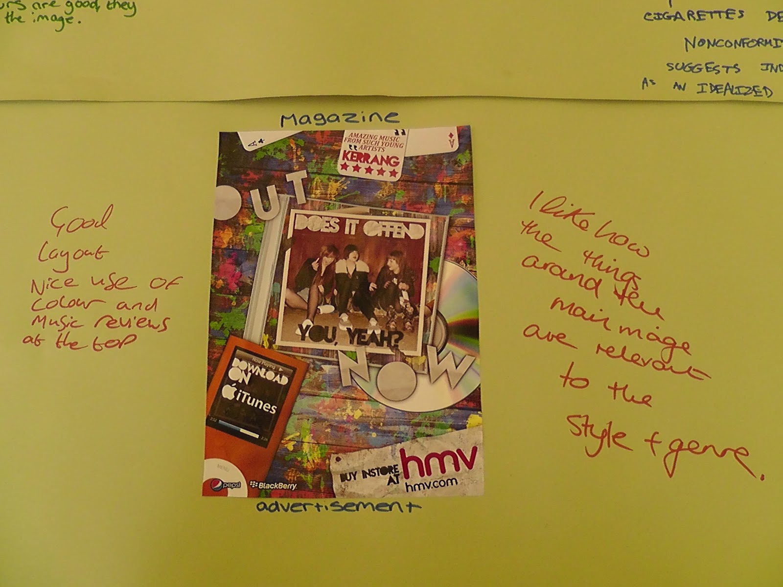
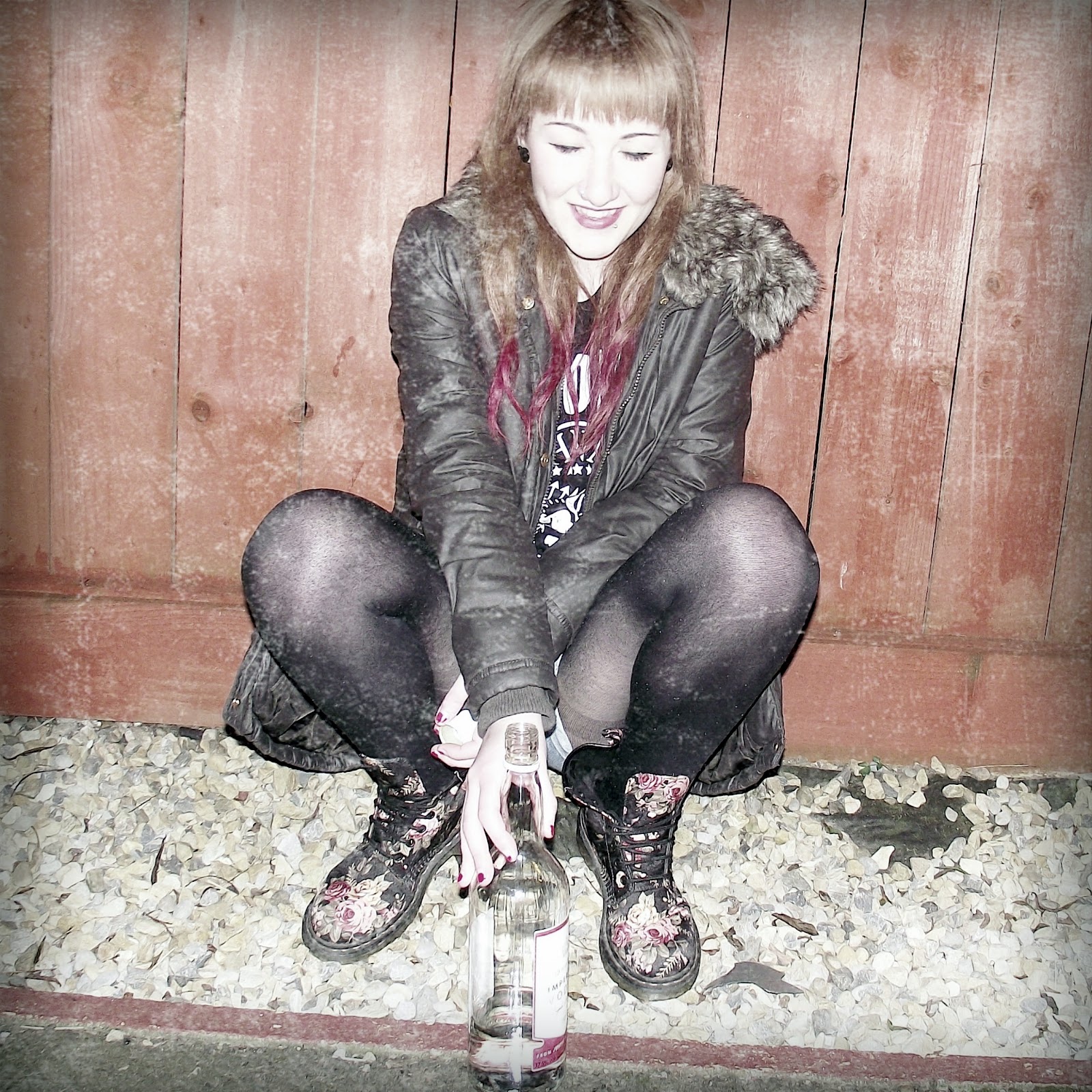
Instead of having an emotional impact on the audience, we have decided to go with a dramatic impact to keep with the theme of our music video as there will be teenagers partying, behaving in a wild manner so we want the images to be consistent with this. The images would be what they may look like after such a party.

What personnel do you need? Who are you going to photograph?
To identify with our audience we have decided to photograph ourselves for the images. This is because we will be of a similar age and young bands tend to be more popular with our audience therefore they will be able to relate more with our products. Another possible benefit of this could be seen in terms of the uses & gratifications theory (Blumer and Katz) because the people photographed are of a similar age they may be able to relate to what is going to in the image.

What props will you need?
As we don't want the image to be too busy we will be using minimal props that link in with the theme of our music video - cigarettes and alcohol being the main props.

How are you going to emphasise colour?
For the backdrop of our photograph we have chosen minimal colours, this being a plain fence. We chose this because we want each member of the group to stand out, by such a large amount of space taken up by one colour it will help emphasise them and attract the audiences attention which is the desired effect we would like. However, we also wanted to image to appear to have a vintage/faded look  - in order to do this we would have to edit the image after it has been taken on software such as photoshop.

Have you briefed your models?
As we are using our own group members they were already aware of exactly what they had to do, from their own ideas on their poses etc. and the individual parts they have played in planning out the project.

What lighting/equipment will you need?
To make the photo more realistic and the fact that we have chosen an outdoor location to shoot our images we thought it would be most convenient to use natural outdoor lighting. The equipment we will need is a tripod to set the camera on, so that the image will be specifically centred and full shots of the band members can be achieved which will make the photo look more professional.

Backdrop/Where will you shoot?
To add to the realism of the image so that the target audience can identify easily we have decided to to use an outdoor backdrop rather than a studio one. As we wanted it to be fairly plain we decided a fence would be the best option.

Costume?
We have chosen to dress our group in the clothes that will be featured in our music video - styles that have become popular with our target audience and chosen genre; this being indie/rock/electronic. This is because it will help our target audience identify with the people in the photograph.

Photoshoot Location Ideas

After discussing with my group members, taking inspiration from our texts we have decided to use a fence as the main background for our photoshoot location. We chose this as it was a fairly simple background to access as it is my own fence, relieving any restrictions we may have had. Also, it is easily manipulated if we needed to make any changes. Finally, it would provide an opportunity to allow the models to stand out from the backdrop.

Friday 30 September 2011

Magazine Advertisement Flat Plan


Colour Usage - In the magazine advertisement a variety of colours will be used, most of these will be bright in order to catch the readers eye as they are flicking through a magazine. The colour of the text will be white as opposed to the bright background and colours used elsewhere in order for it to stand out.

Image Usuage - The main background image will be paint splatters, which will keep in with the party theme whilst the centre image will be the album cover we will design. Also, the other items used such as playing cards and an iPod to display the information on the advertisement such as downloading info and ratings. By using these items it helps incorporate the them into each of our products making it consistent throughout the entire project.

Text Usage - The text on the magazine advertisement will be useful to the reader such as album rating and where the album is available to download. This is vital as it informs the reader exactly what they need to know without providing them with too much information which may cause them to simple ignore the advertisement as it is too 'clogged up' with useless information. The album rating could also push the reader into considering buying the album as it gives the impression it would be worth the money and the iTunes download would appeal to our target audience as it is the main way teenagers and young adults purchase music in the present. The main text will be in the font Nova Solid, the same font used on the album cover, adding further consistency.

Thursday 29 September 2011

Music Video Part Storyboard and Shot Types

In order to film our music video successfully we decided that it would be beneficial to create a list of ideas of things that we could include in the scenes for our music video before we began to design the storyboard.


After coming up with some initial ideas we decided to begin to draft our storyboard containing some of these ideas. Below is the first ten shots of our storyboard.


Under each simple drawing of what the scene will contain we have included a brief description of what will be involved within the shot such as - camera movement, angle, and which shot type will be used. This storyboard will help us ensure that the actors and camerawork will run as smoothly as possible and minimise the confusion of people within the video as they will have a clear idea of what they need to do and what will be taking place.